Behind the scenes of my shoot for Versace Jeans Couture
Giving y'all a look into my process dreaming up and bringing the VJC shoot to life (and other stuff)


Hi guys! So thrilled to announce that the muse has showed up and demanded me (with light gun to my head vibes) to write a long ass newsletter!!
Before I get into it (“it” being an explanation of my process and some BTS from my newest work for Versace Jeans Couture...no biggie...queue Donatella...justice for Artpop, etc), I wanted to share some news with y’all:
-As you might’ve noticed, I switched over my email newsletter to Substack. I like the simplicity of Substack and also love how easy it is to access my archive here. So, from now on you can go to savanaogburn.substack.com to view my archive and keep up with the letters. Add the new email address savanaogburn@substack.com to your address book to be sure I don’t go to spam, please!
-I have three fun new projects out! Click the links in the caption below to see them in all their glory:
The Good Stuff
When I got the call for my new Versace Jeans Couture project, I was thrilled because they used the magic client words: “do whatever you want”. This is something that sounds fantastic to me when I first hear it, but often can set me up to have so many different ideas that I become paralyzed and actually can’t do shit. That’s basically how this project started. I started pulling together some bizarre ideas- the words “beige”, “dramatic”, and “disgusting” come to mind- trying to create something that felt outside of my usual colorful kitschy world. I’d been doing a lot of very frou frou wacky work lately and wanted to pivot hard in another direction.
When I tried to actually build out this concept, I had nothing to say about it. No direction. No thoughts in the brain outside of “SOMETHING TO GET OUTSIDE OF MY IDEA OF OTHER PEOPLE’S PRECONCEPTIONS ABOUT WHO I AM AND WHAT MY WORK LOOKS LIKE, PLEASE!”. I talked to my manager, McKenzie, and she was like, “lol ok you need to start making color palettes and base each character around those”...and that was the key. Once I started doing that, ideas came SO fast. And at the end of the process...the images looked colorful and kitschy and wacky and nothing like the bizarre initial direction I thought I wanted to go in. I think the lesson in this is that I can’t escape myself!!! And that the art is my boss, not the other way around. It’s gonna be what it wants to be, regardless of how much I try to white knuckle it into something else. So that’s my first lesson. Moving on.
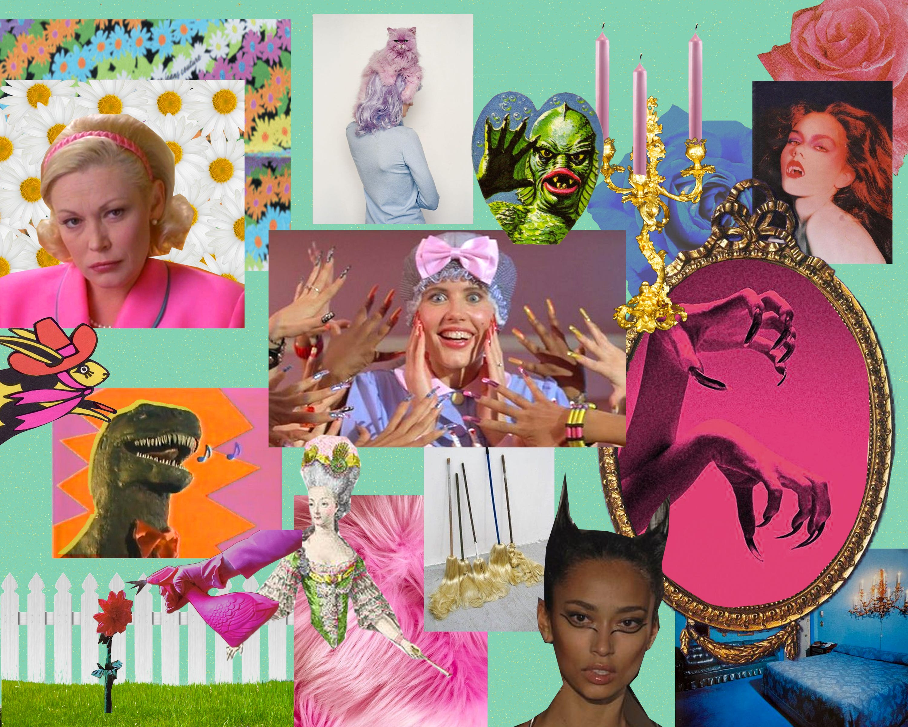
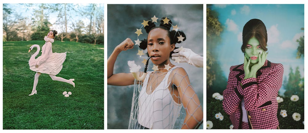
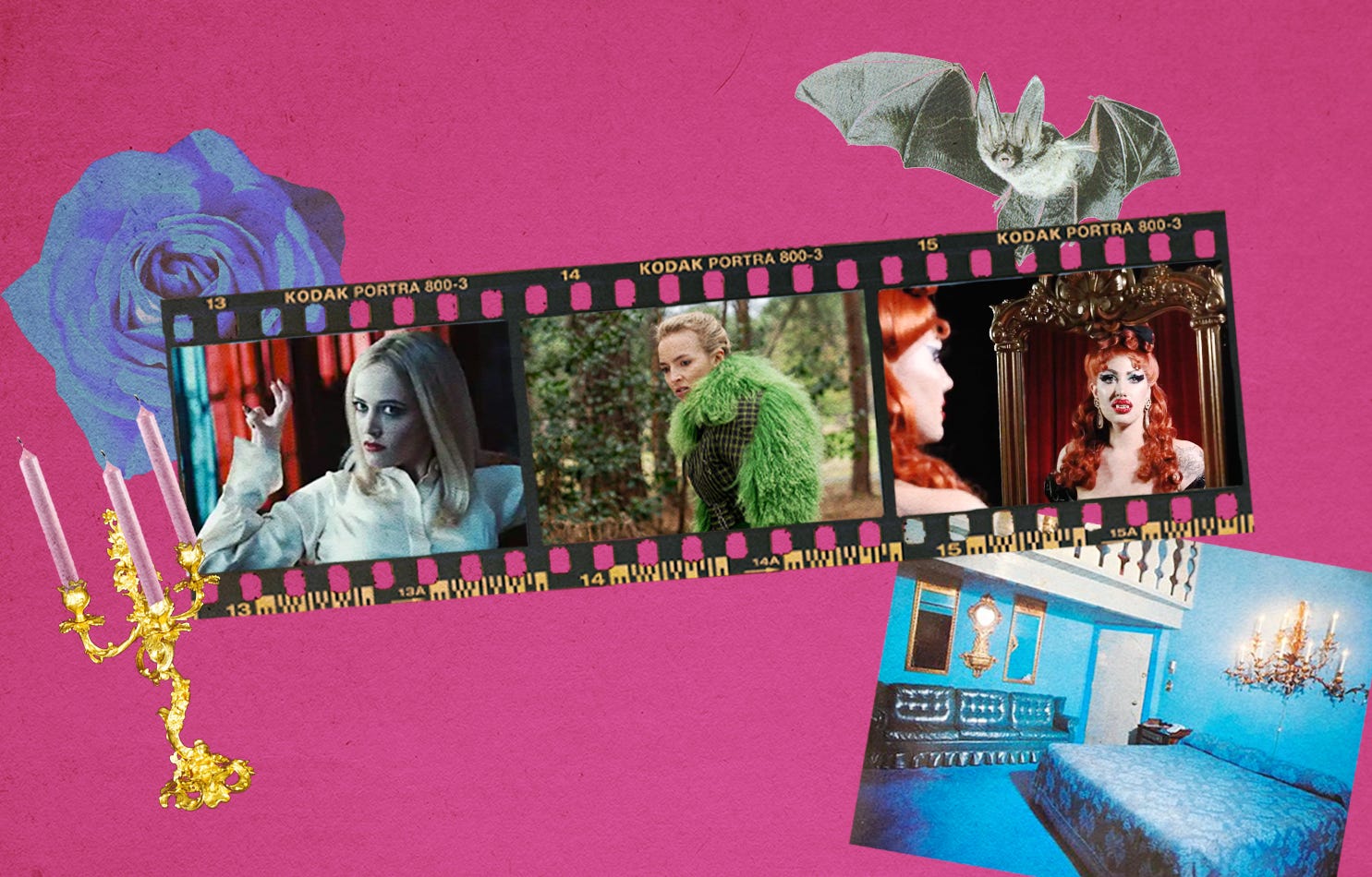
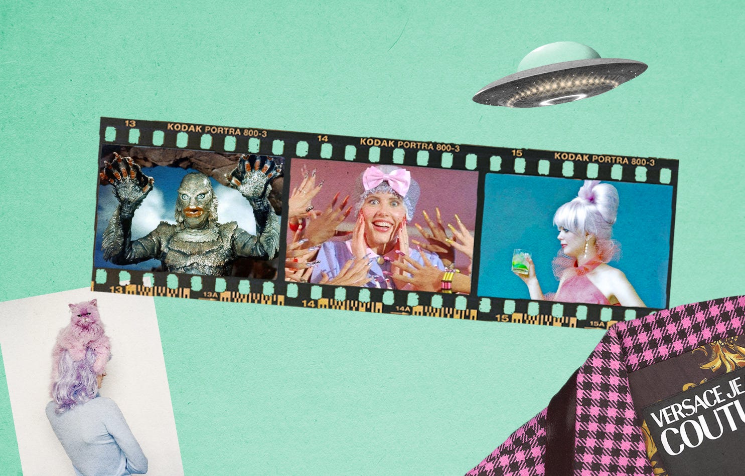
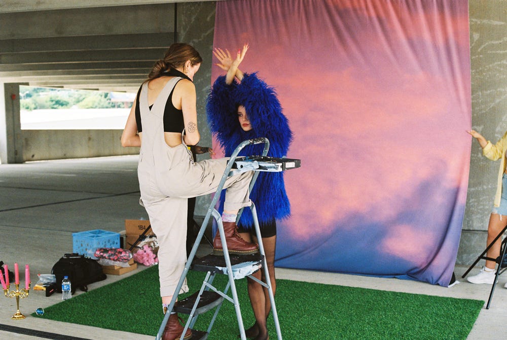
I fleshed out 3 characters- at this point, I’m barely interested in photographing people without creating some kind of backstory for them and using that for the foundation of the images. The first good idea that came to me was this vampira character- I wanted to reference femmes in pop culture that are EVIL and GORGEOUS. My north stars were Villanelle from Killing Eve, Anglique Bouchard from Dark Shadows, and one of my favorite drag performers/hosts, Miss Malice. I also loved the idea of shooting a vampire in a beautiful garden sunset-y vignette for the drama of it all.
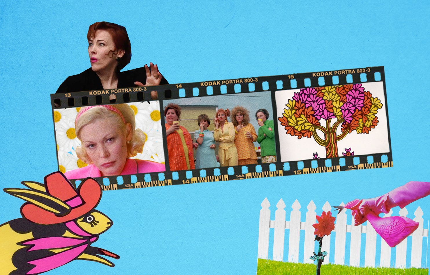
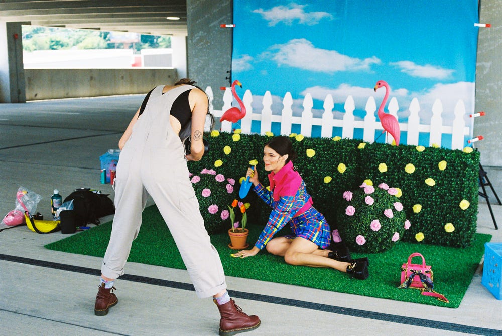
The second character truthfully came out of a need for a pink, orange, and yellow set (I was pulling my color palettes from Versace Jeans Couture’s FW collection), so I somehow landed on this deranged gardener character. I was inspired especially by the scene in But I’m a Cheerleader where Cathy Moriarty furiously waters her plastic flowers (I’ve watched that movie a bunch lately), and I pulled color inspiration from Edward Scissorhands and some old John Alcorn illustrations. I loved this one because it was super prop heavy (my fav) and I got to craft those little faux potted flowers.
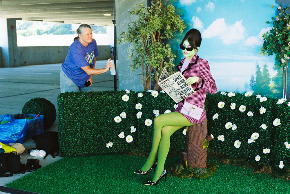
The alien character is something I’ve wanted to do for a long time- inspired by Earth Girls Are Easy (but if Geena Davis was the alien), Creature from the Black Lagoon, and the B-52s. My icons, of course. I also just felt like that cute pink tweed set belonged on a green person- it’s called color theory, obv. I hand crafted the tree stump entirely based on a truly inspired Anthropologie display from 2010 (don’t you miss the time when a blogger would take Nokia-quality pictures at Anthropology and then write a whole blog post about it…I’m trying to rekindle that vibe here via newsletter) and I had a damn blast. Cardboard is my favorite 3D medium I think.
Without boring you to death I want to talk quickly about the logistics that go into a shoot like this to try and demystify the “art comes out of thin air for EVERYONE BUT ME!!!” feeling I sometimes have…
To be transparent, I had a very small budget for set design and dipped into my personal day rate to pop OFF- I’m of the belief that I’m not going to do a project if I can’t fully execute my vision. So I did what I needed to do to execute said vision. I decided on a garden-esque setting for each character, thinking I’d shoot these on location in an actual garden that I could set dress. Then I was offered a location with gorgeous natural light at all times of day- a parking deck- and decided to take advantage of that instead. So the garden got fabricated! Which was ultimately very fulfilling and fun to me. I love designing sets almost as much as I love making pictures. I got the shrubbery that I used for all three sets at a local greens rental business, Cinema Greens, and the topiaries, trees, and some other small props from Central Atlanta Props & Sets. This was my first time sourcing things from actual prop rental houses and not feverishly making all of them/thrifting them myself and WOW did it make my life easier and the pictures better. I’d be remiss not to mention sweet Demetrius who introduced me to these prop houses and lent us the location and also was an incredible host/assistant. The best!
This was the first shoot in a long time where I wasn’t also the producer...McKenzie was! So the day of the shoot went very smoothly- Demetrius, Iris, and McKenzie helped me build the sets and Iris dressed them. It’s so much easier to do my job when I’m not also doing 1500 other jobs...imagine that<3
I shot everything on film (all film/developing/scanning costs were worked into the budget) and spent the week after the shoot under my “color toning blanky” retouching and making everything cute.


You can see all the final pictures on Versace Jeans Couture’s Instagram, and if you want to see some outtakes, you can find them on my website.
Anyway, the whole point of this newsletter at this point is to try and share information that I would’ve benefitted from when I was first getting into photography (and even now- I love reading in depth about other artists’ practices). I hope this is somewhat helpful or interesting- if you have questions, reply to this email or comment and I’ll answer them in my next newsletter. <3 thank you for reading, my literate queens